
Hello creative friends!
I thought I would share some color charts and a painting I completed recently using Mount Vision’s 25 piece “Thunderstorm Grey” set.

This set is full of beautifully greyed-down colors, as you might expect! I was a little surprised to see a few greens in it, but they turned out to be super helpful in the little study I painted using this set exclusively.
Here is a teaser of the colors on two different papers: Uart 500 and an unknown white, textured paper.


These pastels are wonderful. They are really large and easily break into thirds, which makes them economical and easy to spread out into different boxes. I put a third into my plein air pastel box, a third into my studio box, and the other third on reserve for when it’s time to reorder.
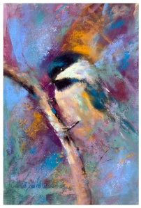
And here is the study I painted using this set only.

More on this study, including progress shots, in a future post.
Till then, keep creating!
~R

Very dark, but hopeful.
LikeLike
Yes, that’s what drew me to paint this scene!
LikeLike
Beautiful !
LikeLike
Thank you 😉
LikeLike